
TWENTY EXCHANGE
At the heart of New York’s Financial District, 20 Exchange Place is a landmark with a story built into every detail. Originally constructed in 1930–31 as the City Bank-Farmers Trust Building, its limestone façade is layered with Art Deco ornament, intricate detailing, and carved coins from around the world: a reflection of its history at the center of global commerce.
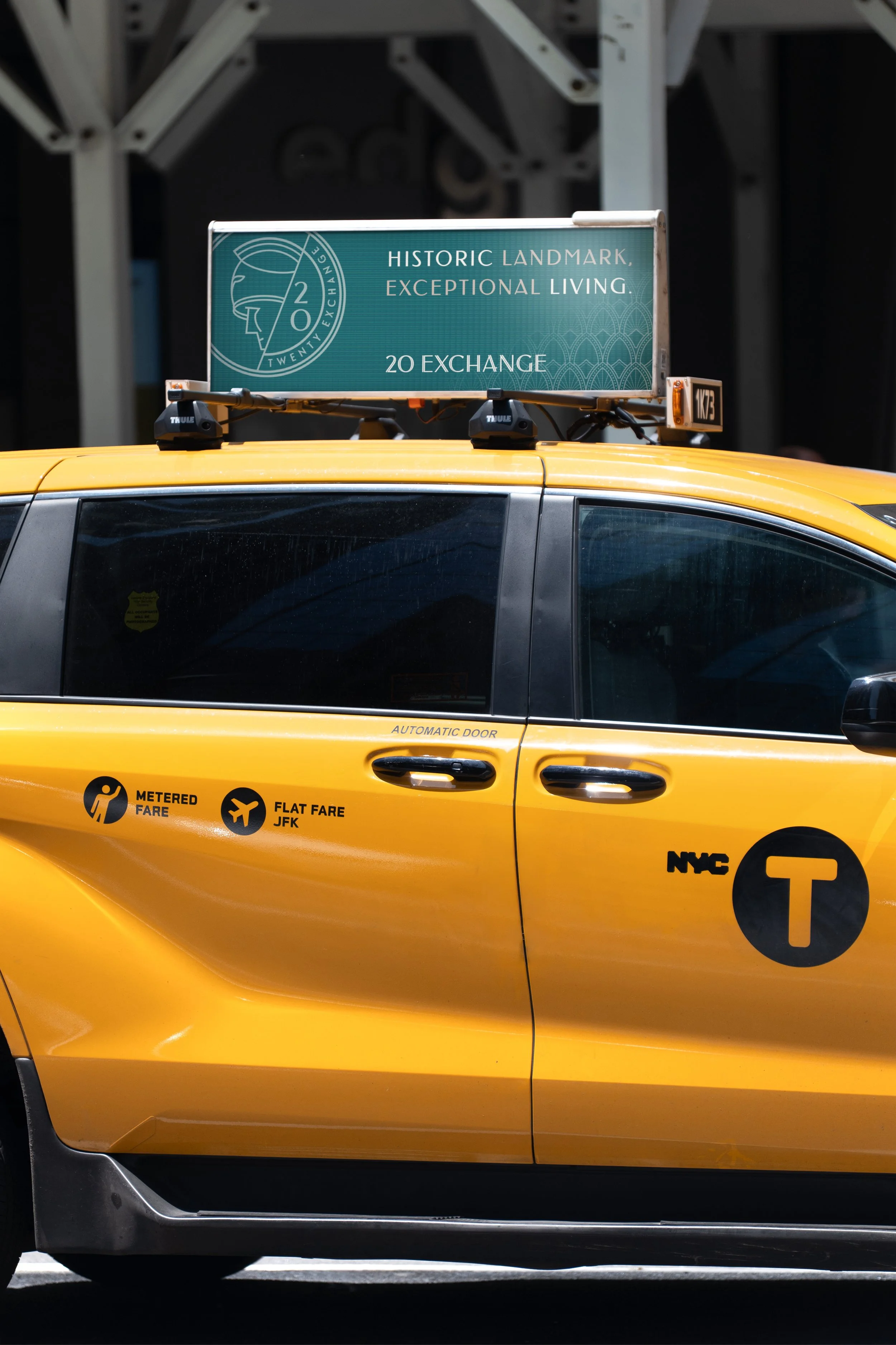
As the 767-residence skyscraper entered a new chapter, the challenge was to reintroduce its grandeur to a new generation of New Yorkers. The rebrand positions 20 Exchange Place as a premier luxury rental experience, bringing a more contemporary perspective to one of Downtown Manhattan’s most distinctive addresses.
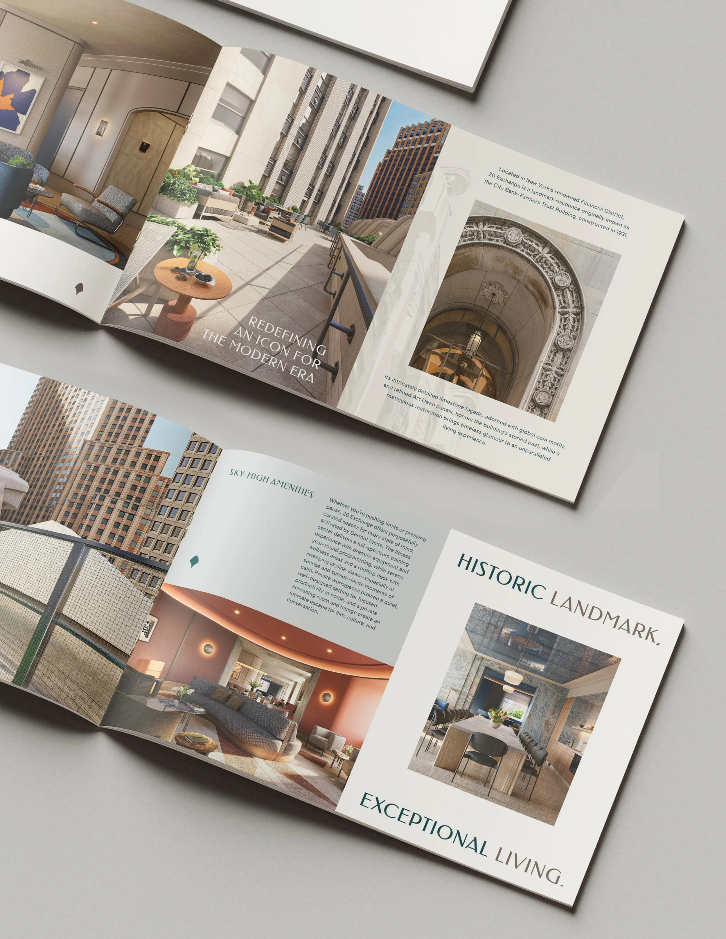
Redefining an Icon for the Modern Era
-
Identity Design
Art Direction
Brand Strategy
Marketing Collateral Design
Copywriting
Lifestyle Product Collection

A Legacy in View
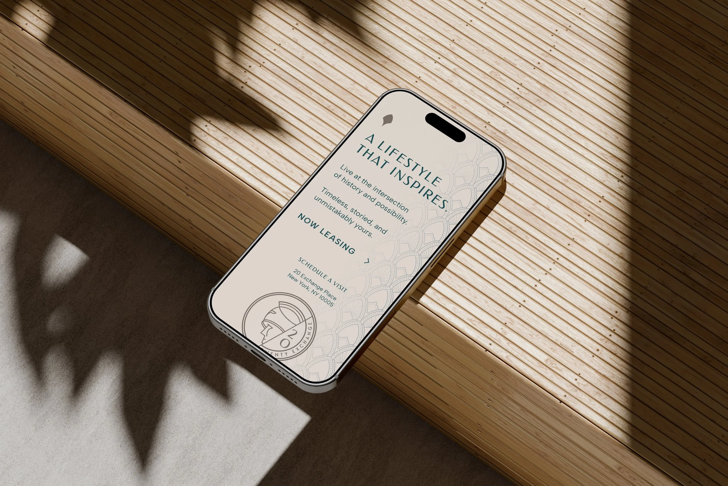
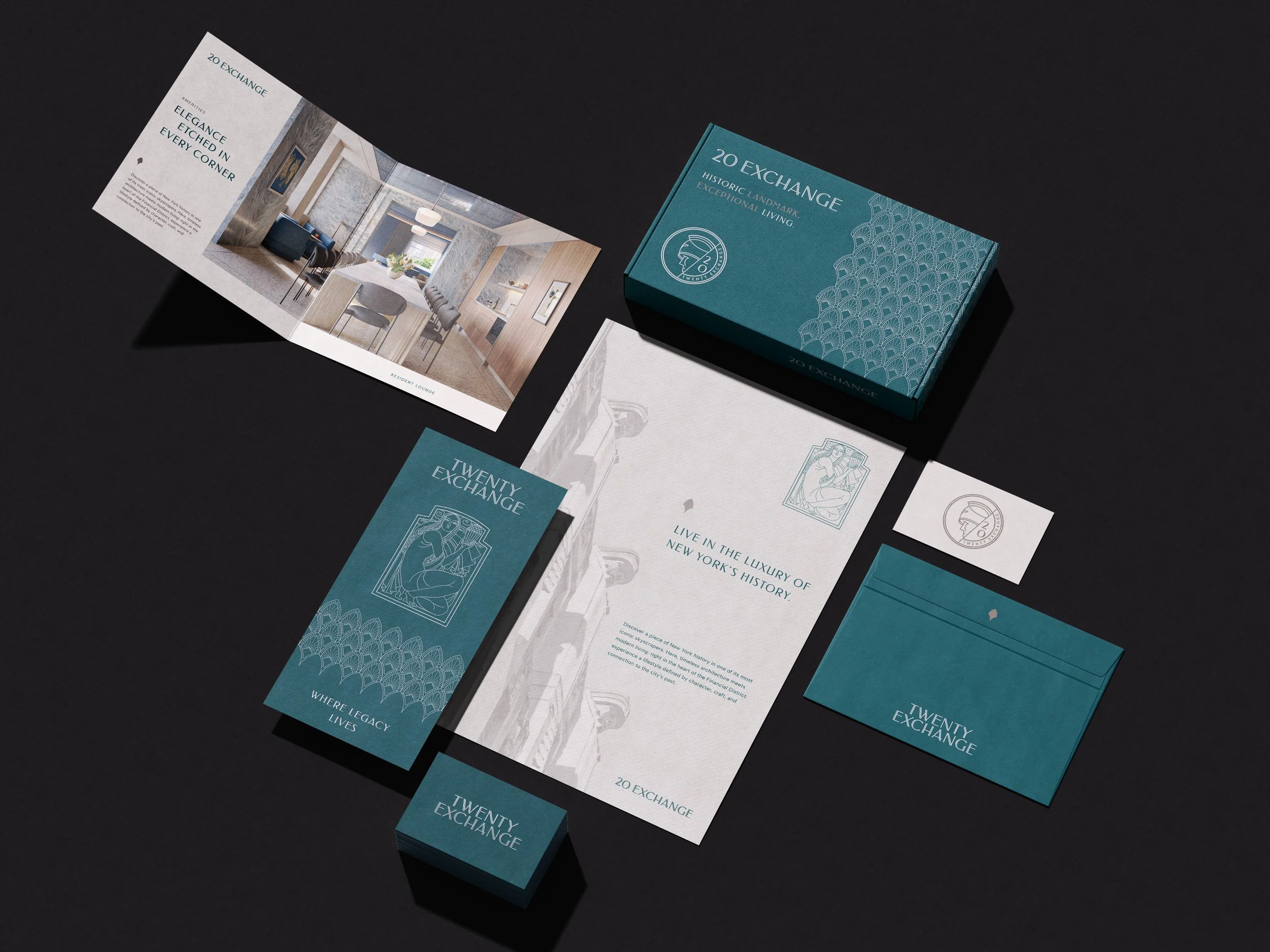
Rising above the city, a monumental figure, a giant of finance, speaks to the grandeur and ambition of New York’s financial past. Rarely seen from street level, this architectural detail became the hero of the visual identity, bringing a hidden piece of 20 Exchange Place into the spotlight and inviting residents to discover the stories embedded in the building.
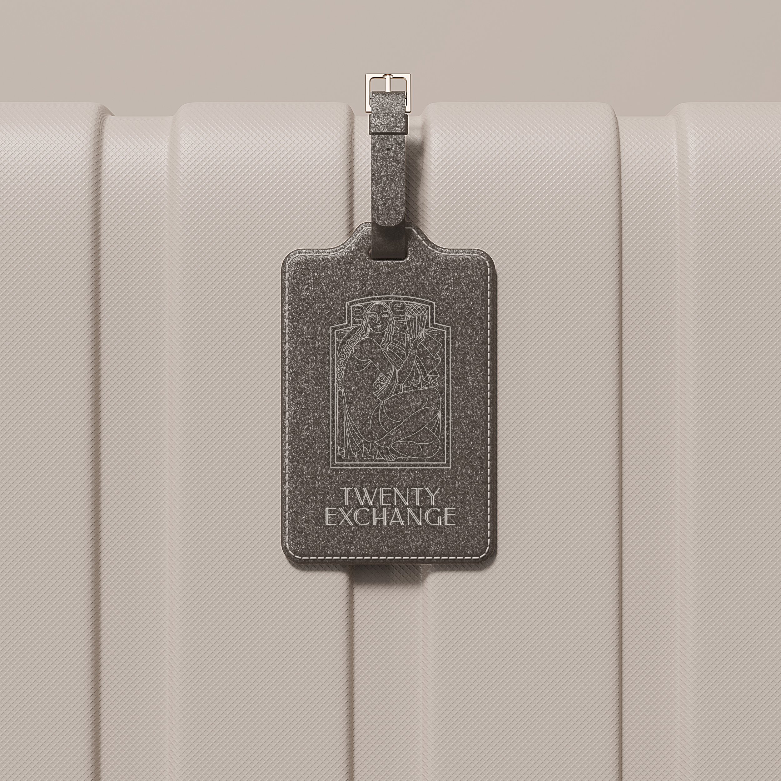
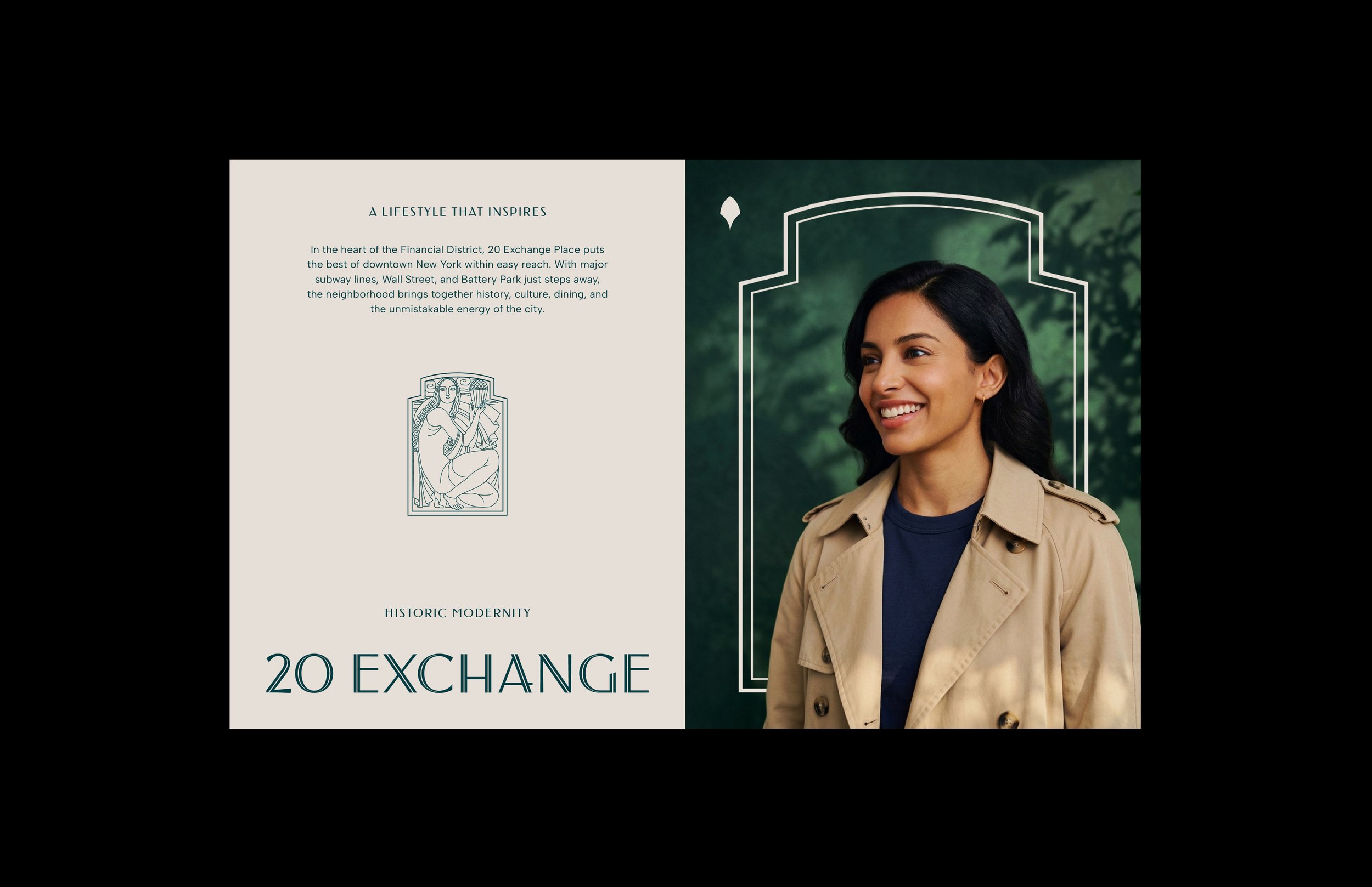
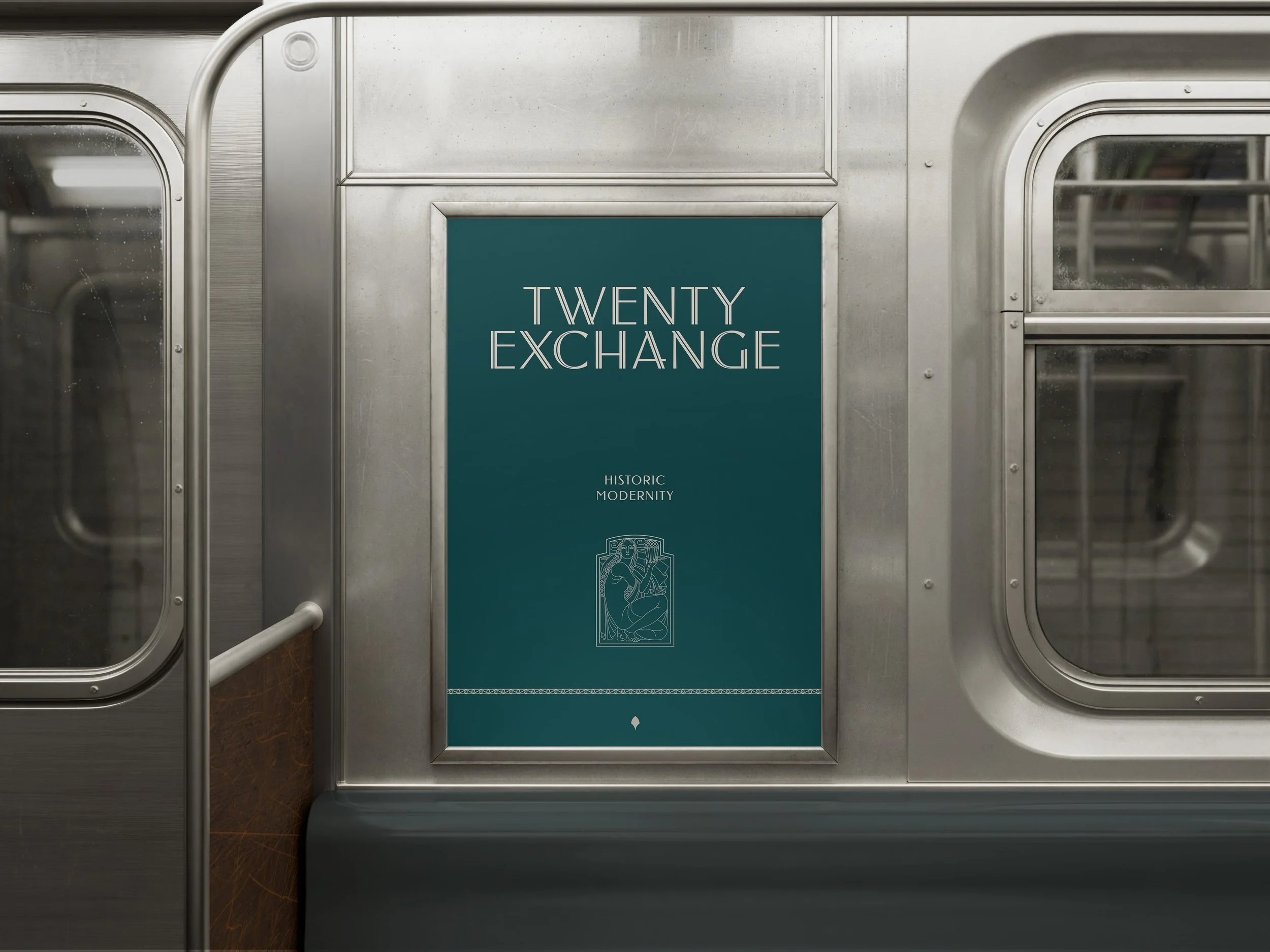
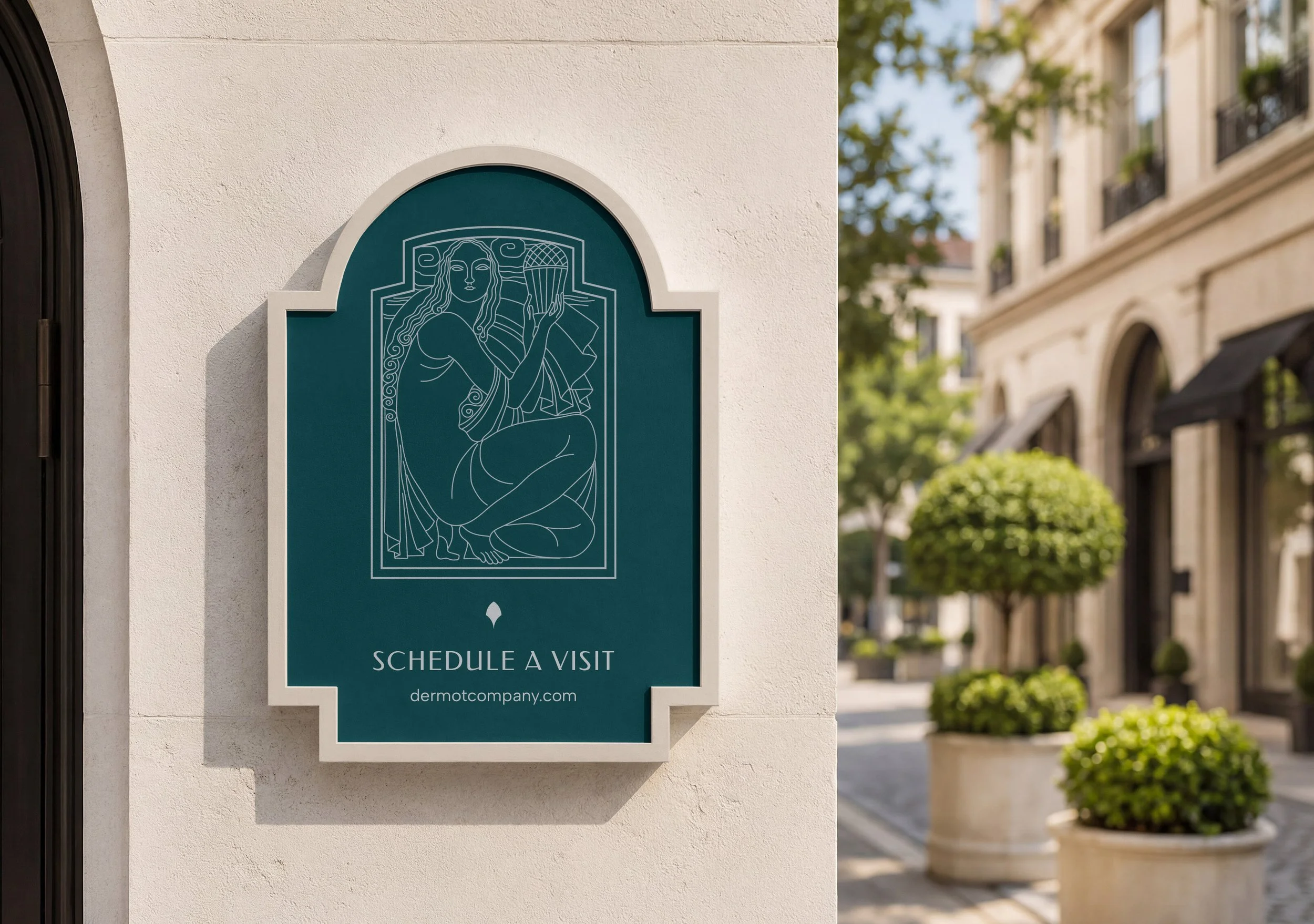
Another distinctive figure, the muse, encountered at the lobby elevators, became a complementary graphic element throughout the brand. Reinterpreted for use across collateral, the illustration adds a sense of warmth and personality while creating a visual thread between the building’s architecture and its contemporary identity.
TWENTY EXCHANGE
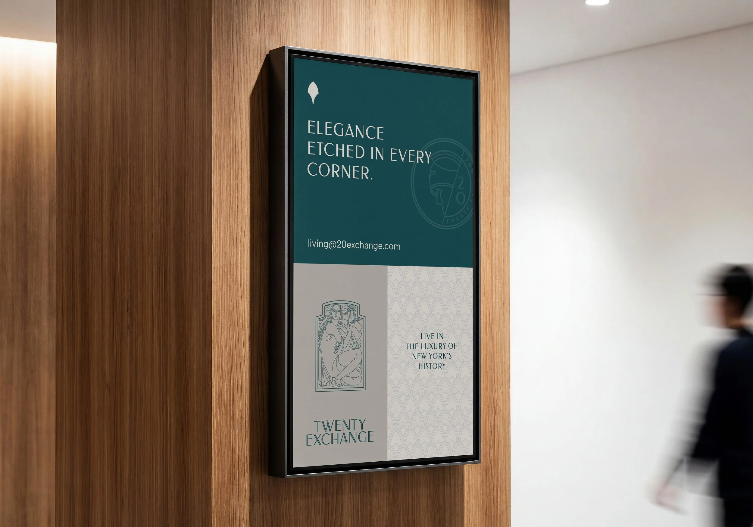
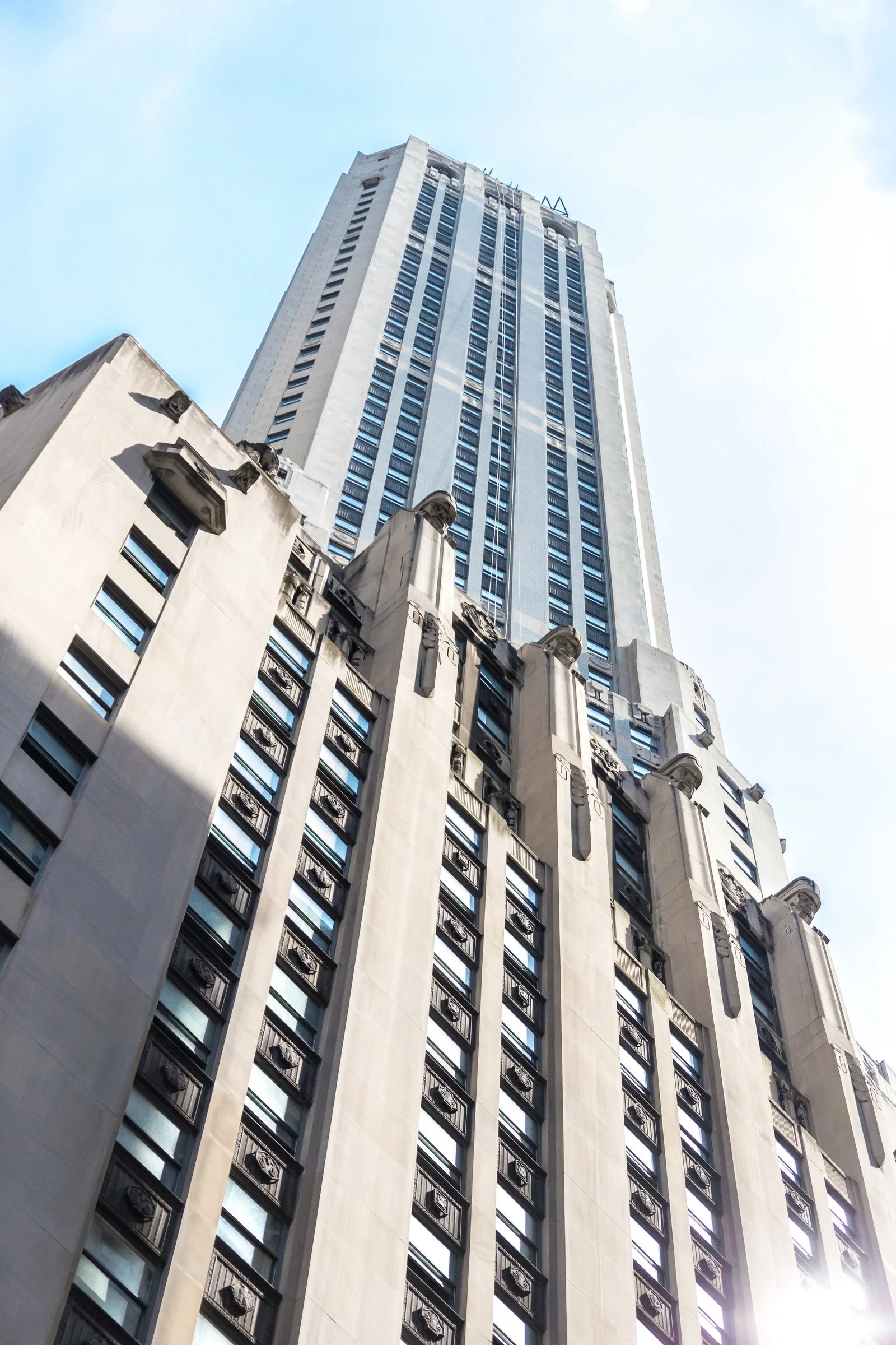
Archival photography and signature architectural elements became the foundation for the new identity, creating a visual language that feels deeply rooted in place while decidedly of the present. The result is a brand that celebrates the character of old New York through a more modern lens where Art Deco glamour meets contemporary city living.
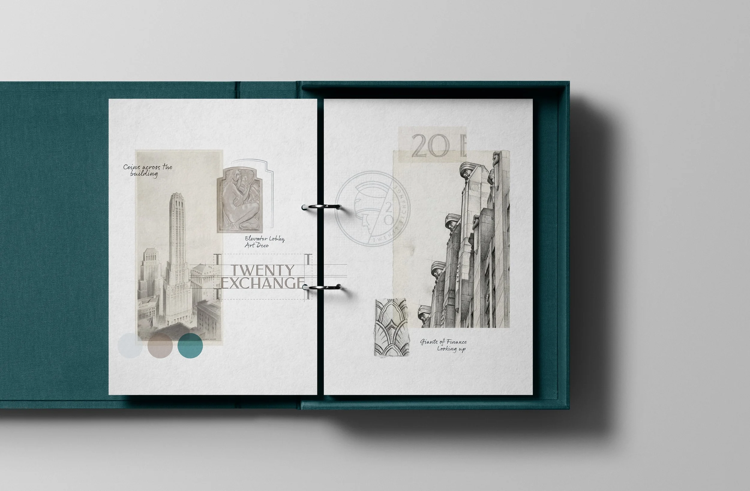
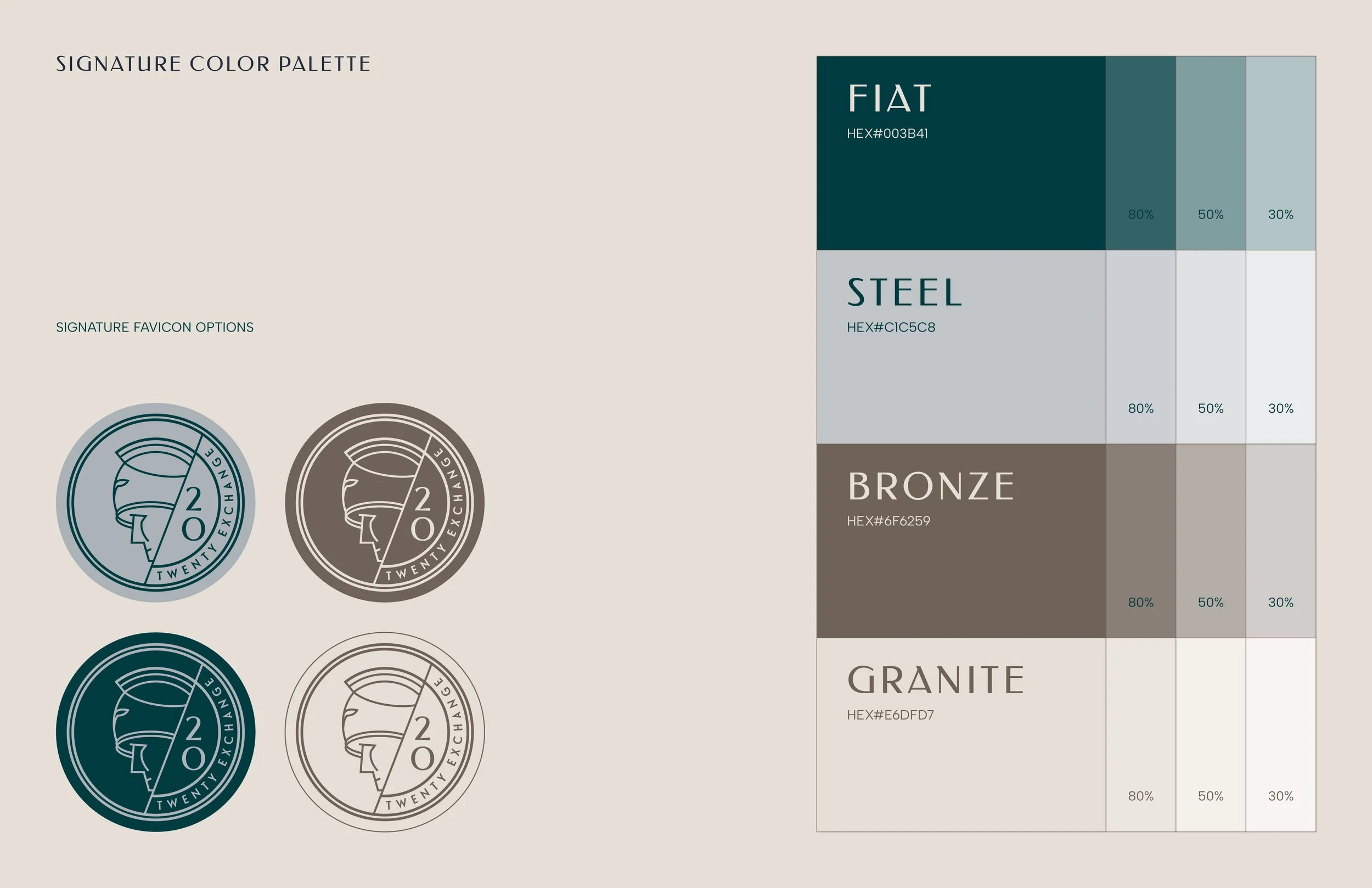
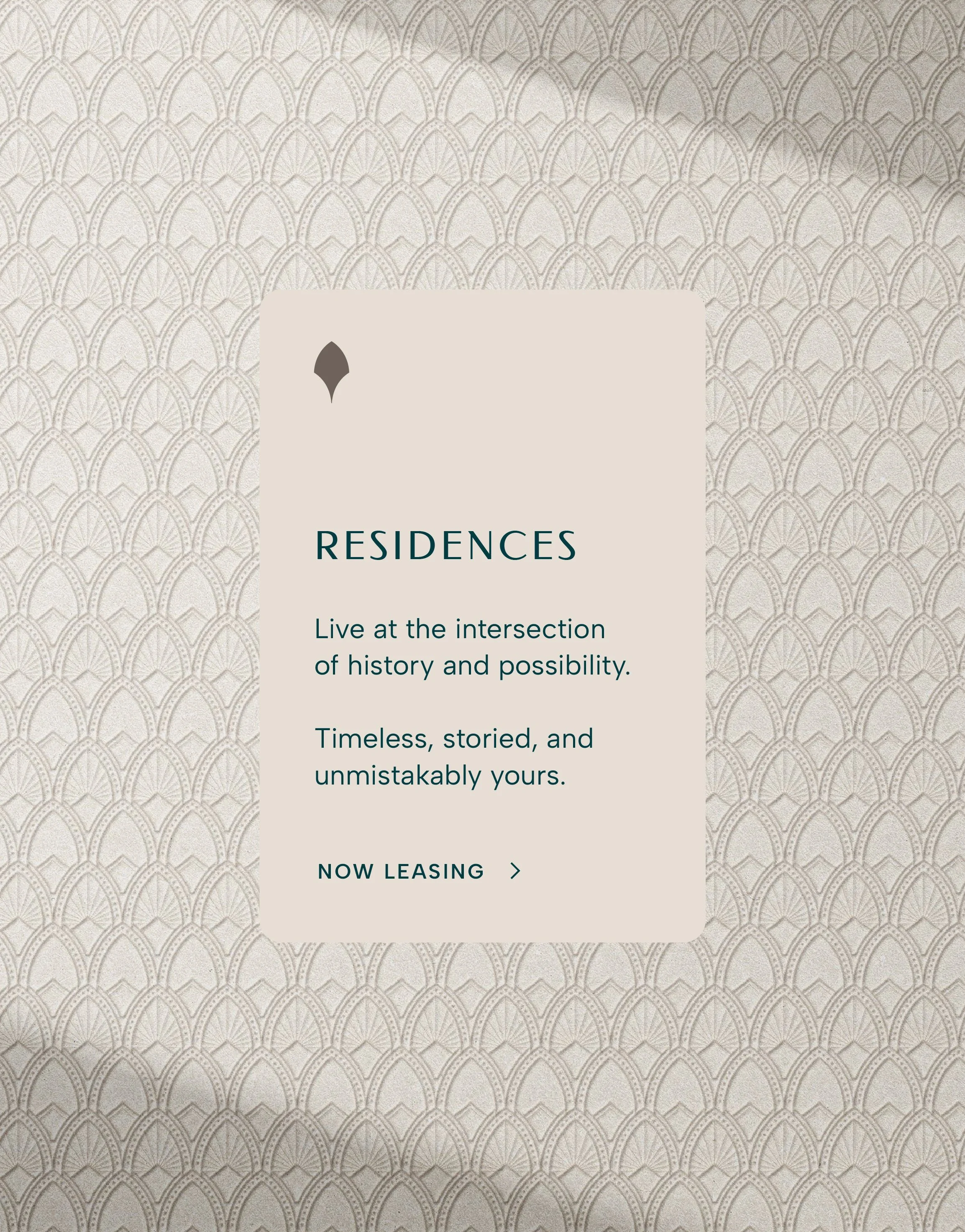
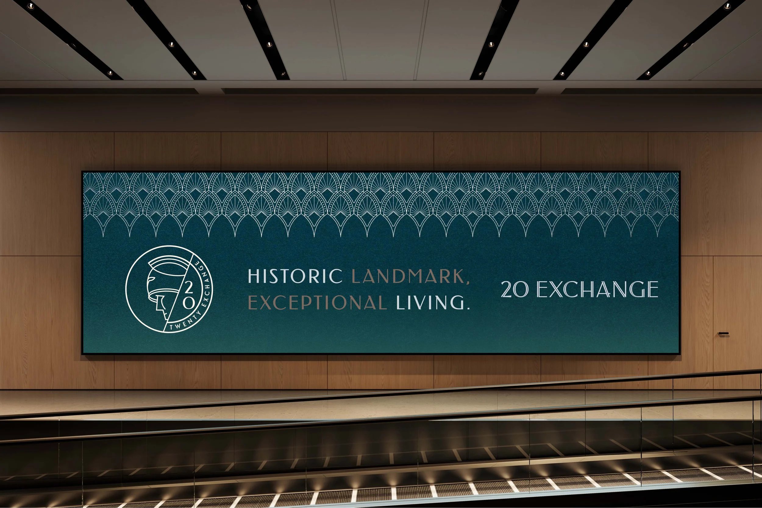
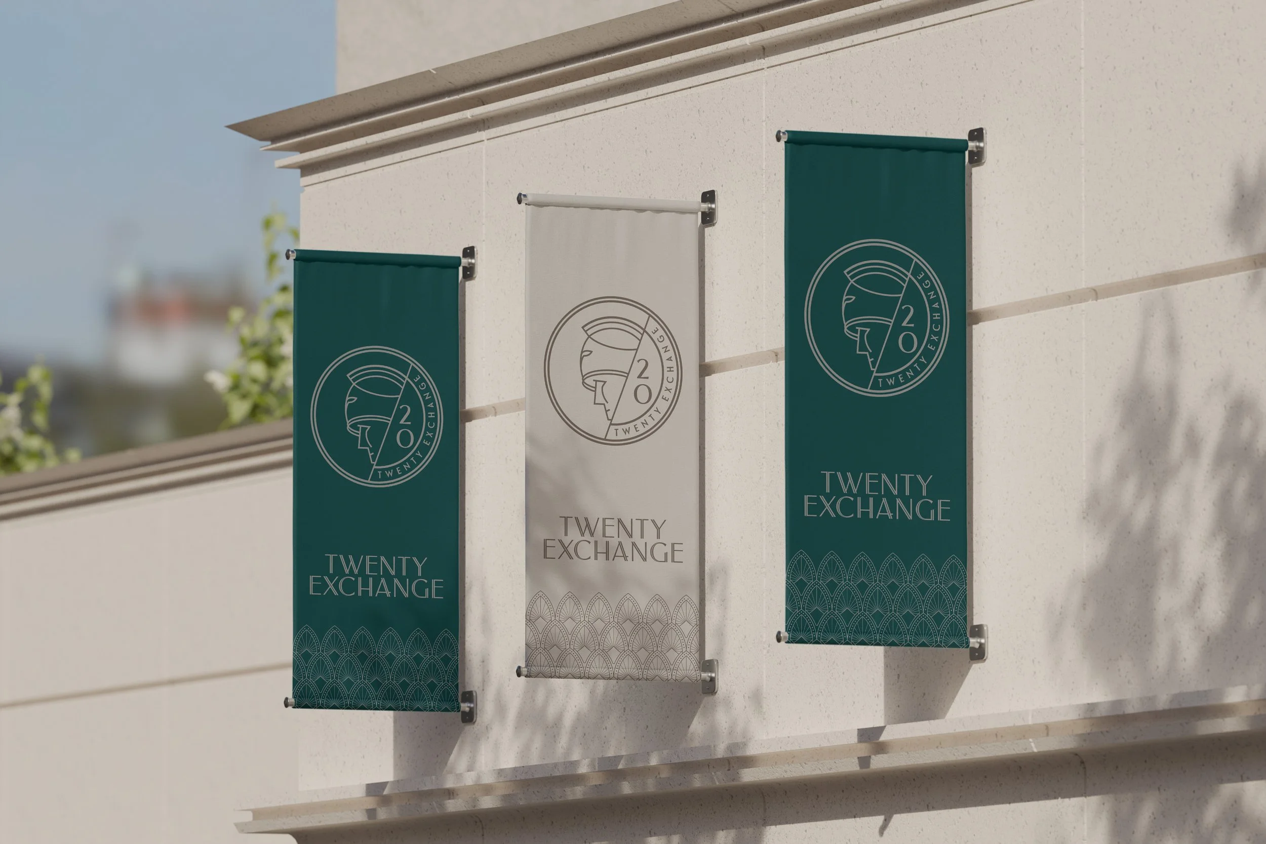
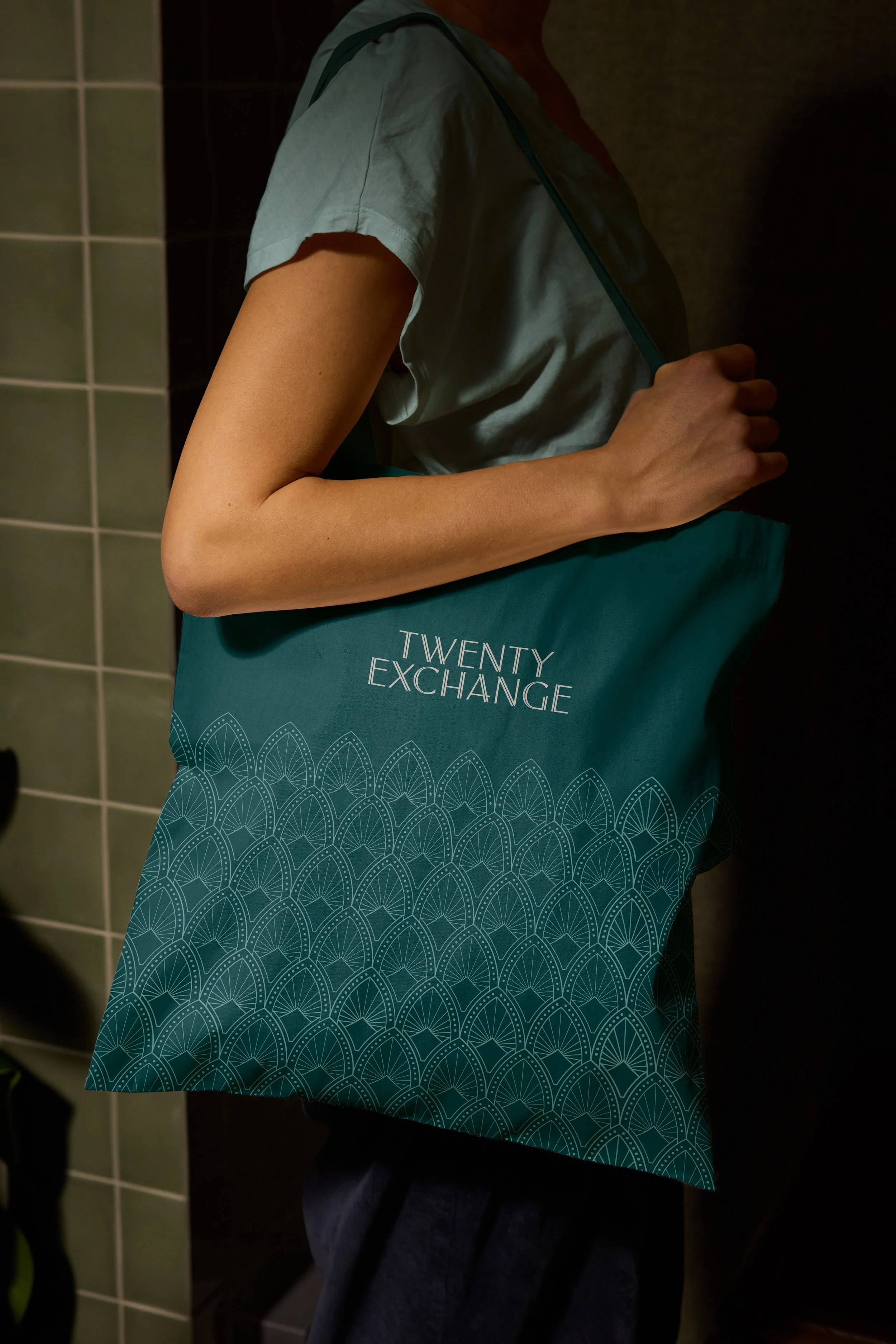
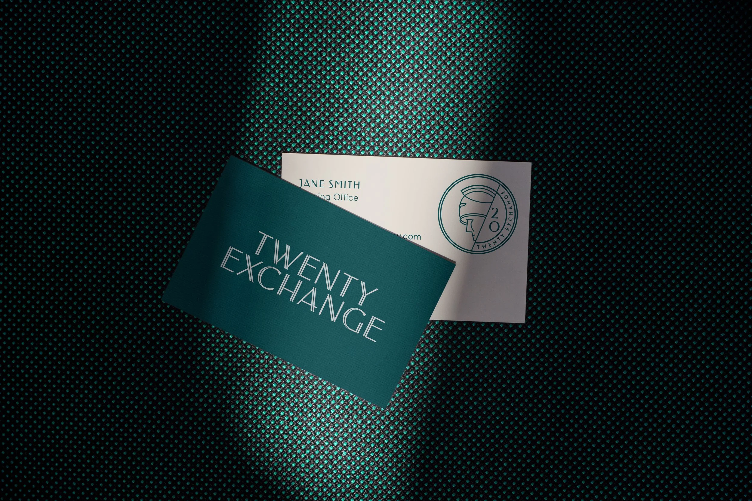
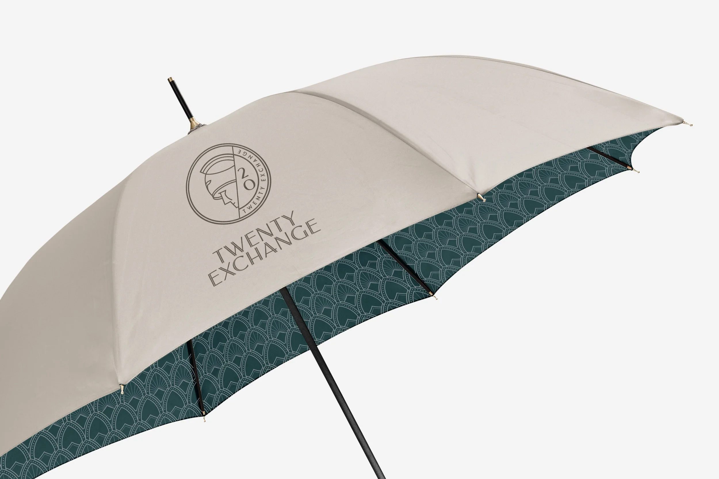
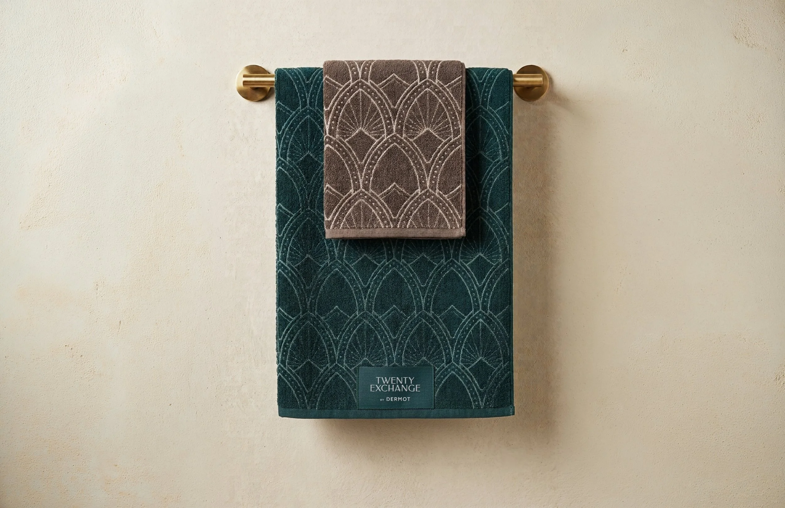
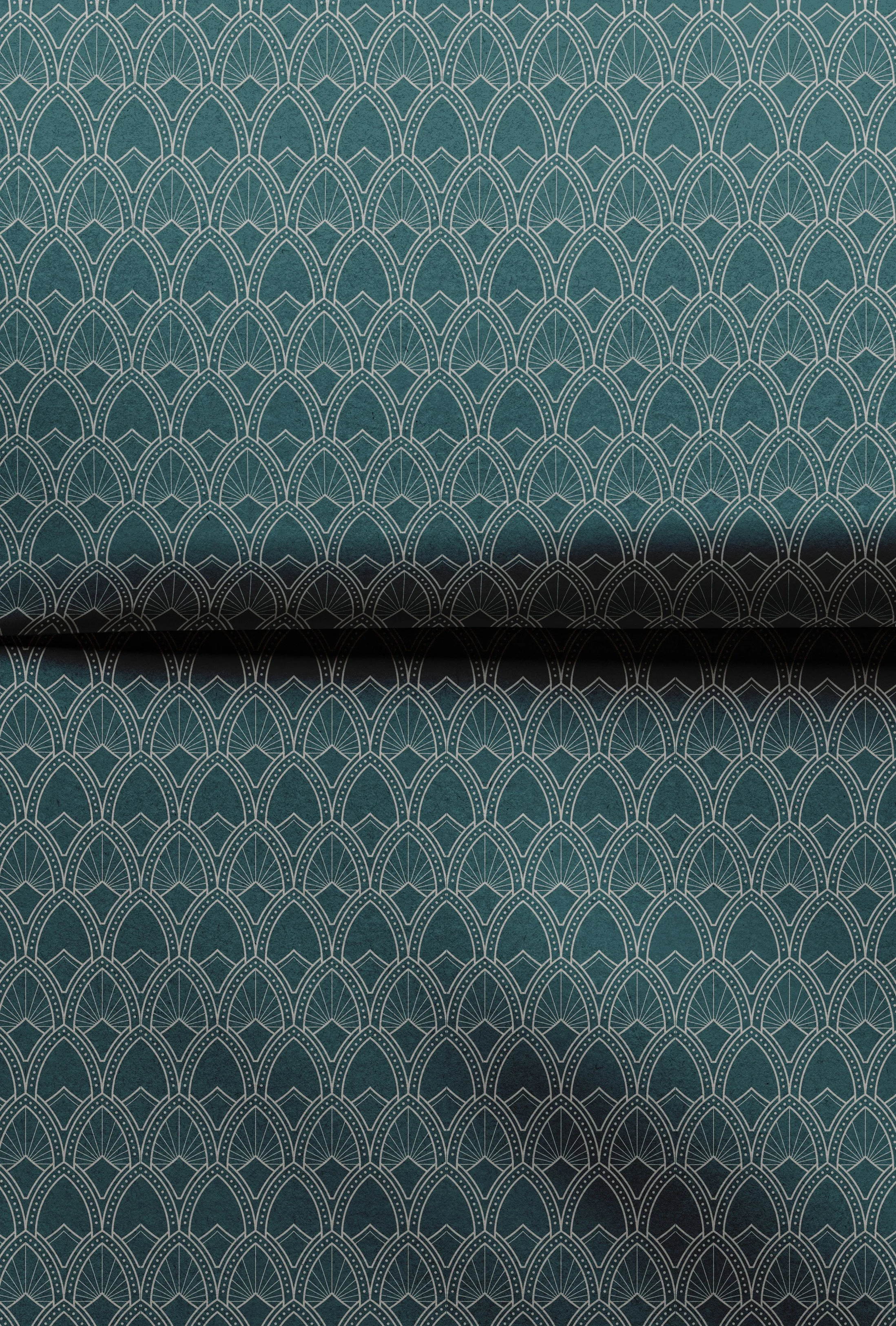
The identity brings the building’s history into focus through details that might otherwise go unnoticed. A coin-inspired icon anchors the brand, while a bespoke Art Deco pattern draws directly from the building’s architectural language. Carried through as custom wallpaper in the amenity spaces, the motif creates a cohesive visual thread between the residence’s historic character and its newly elevated experience.
Objects of Belonging
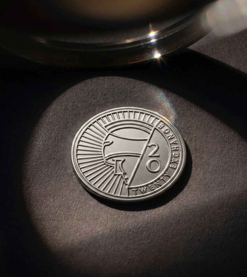
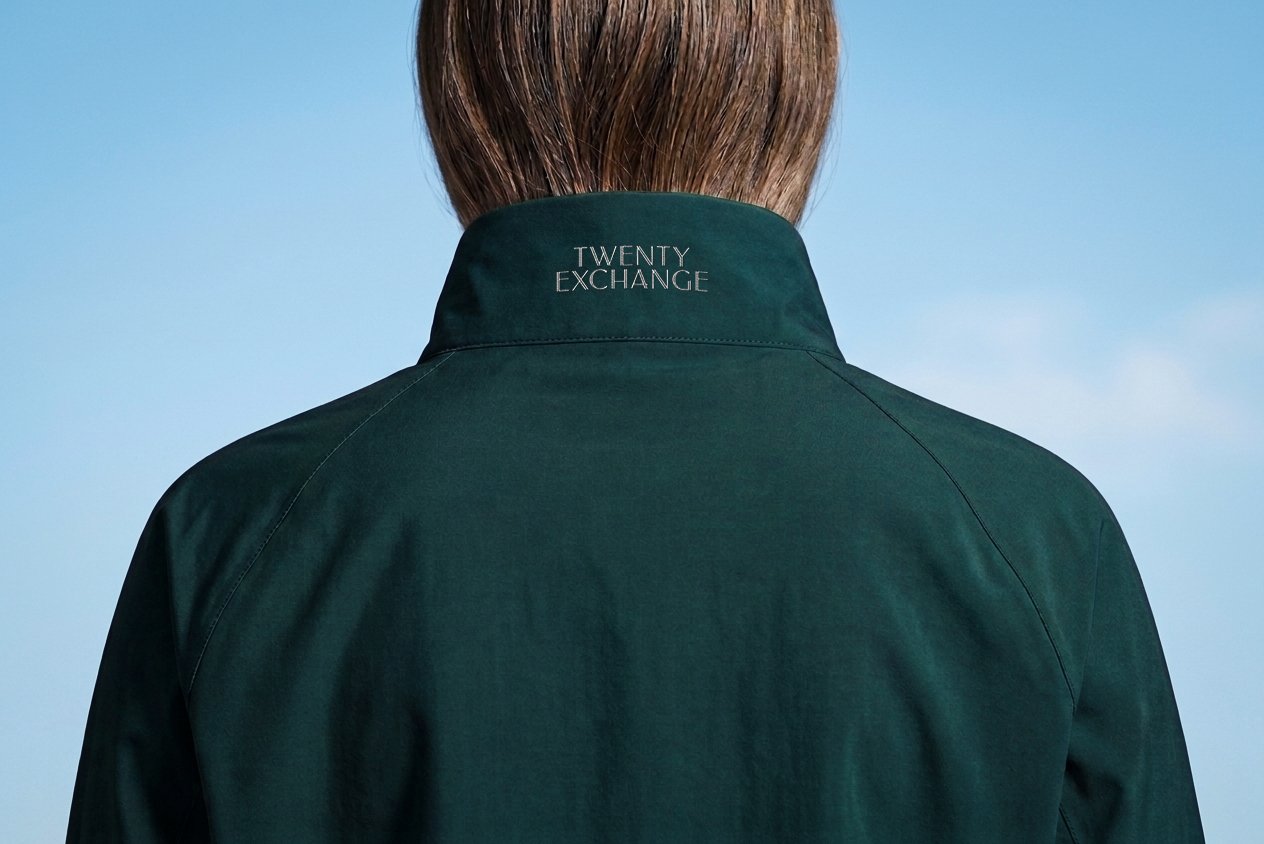
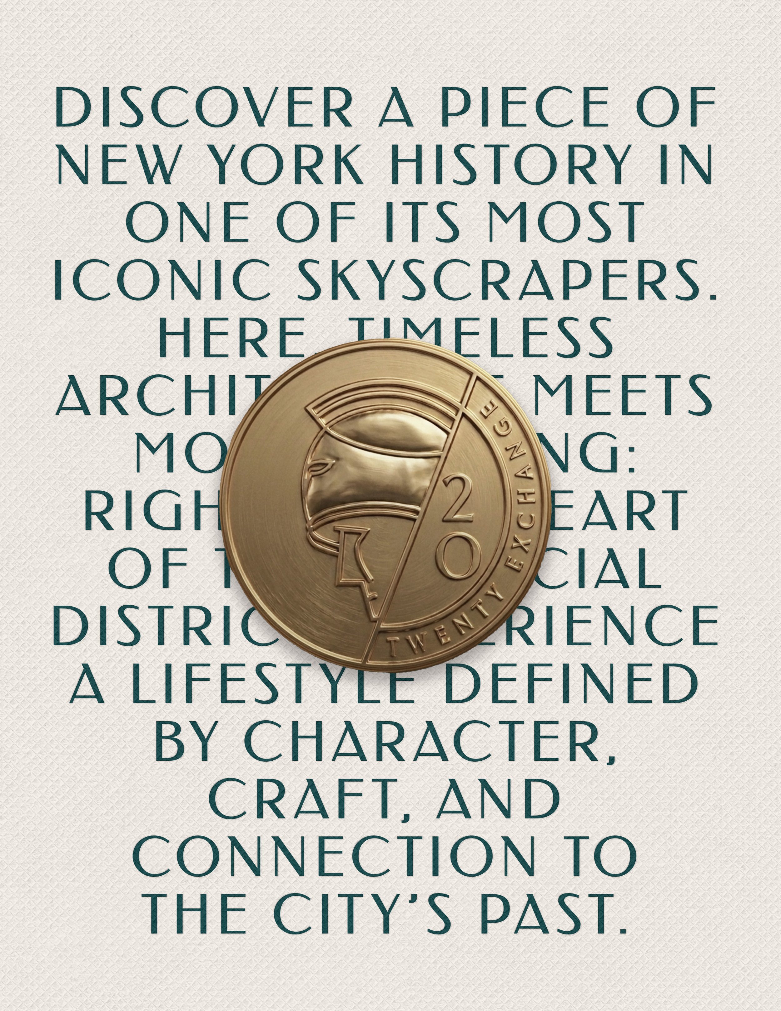
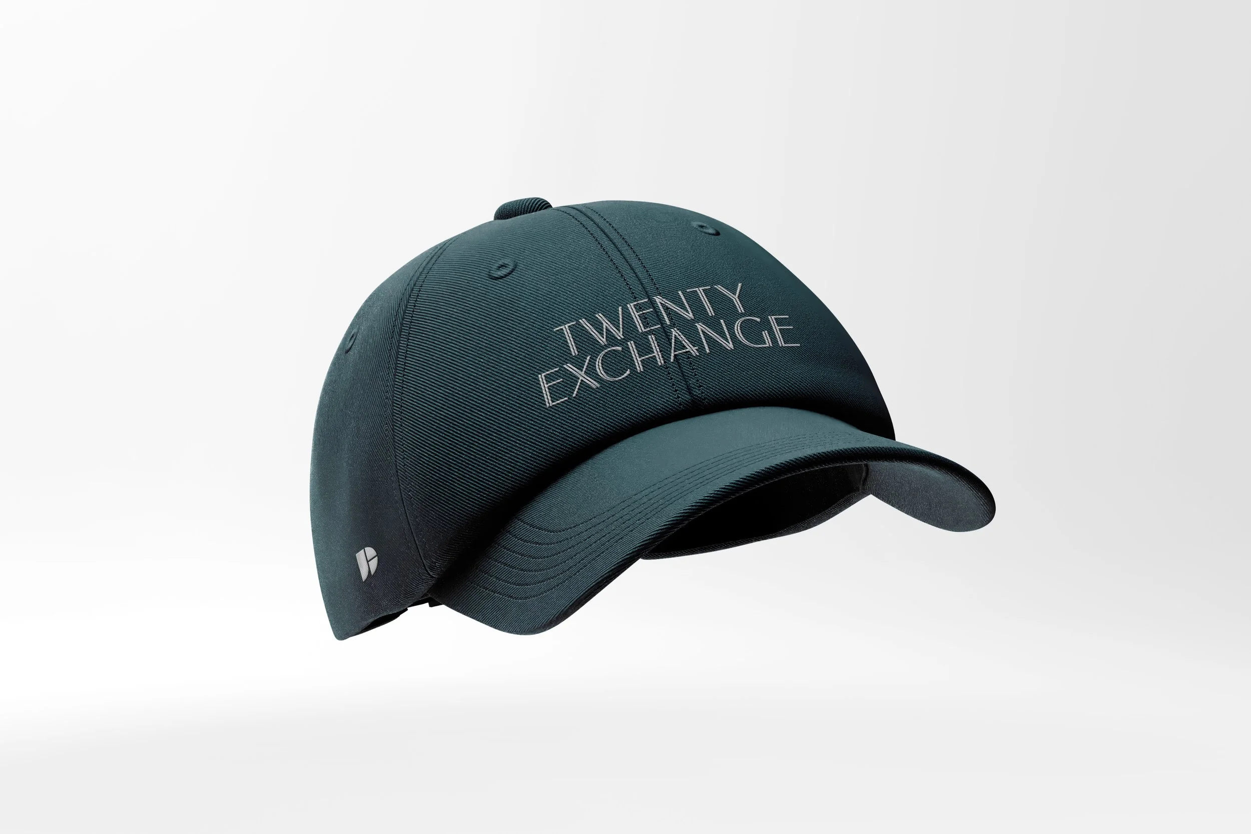
The identity extends into a bespoke lifestyle collection designed for the daily rituals of 20 Exchange residents. Inspired by the coins on the building’s façade, a custom coin featuring the Giant of Finance serves as a membership token, unlocking select amenities and exclusive offerings.
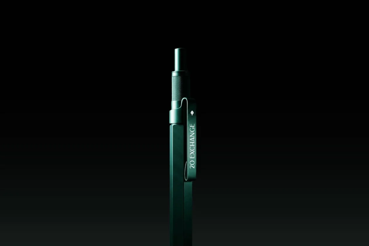
Everyday essentials round out the collection, playfully incorporating the identity’s graphic language to bring the spirit of 20 Exchange into daily life.
TWENTY EXCHANGE



These projects were made possible through collaboration, with contributions credited wherever possible. If any attribution has been overlooked or requires correction, please get in touch.
Client: Dermot Properties
Brand Identity Collaboration: Frederick McSwain
Interior Architecture: JG Neukomm Architecture